Most people think that the only part of the website you should be paying attention to is “above the fold,” or the part of the website that people can get to without further scrolling.
Optimizing “below the fold” (the parts that need scrolling, too) is often neglected – but that’s a big mistake.
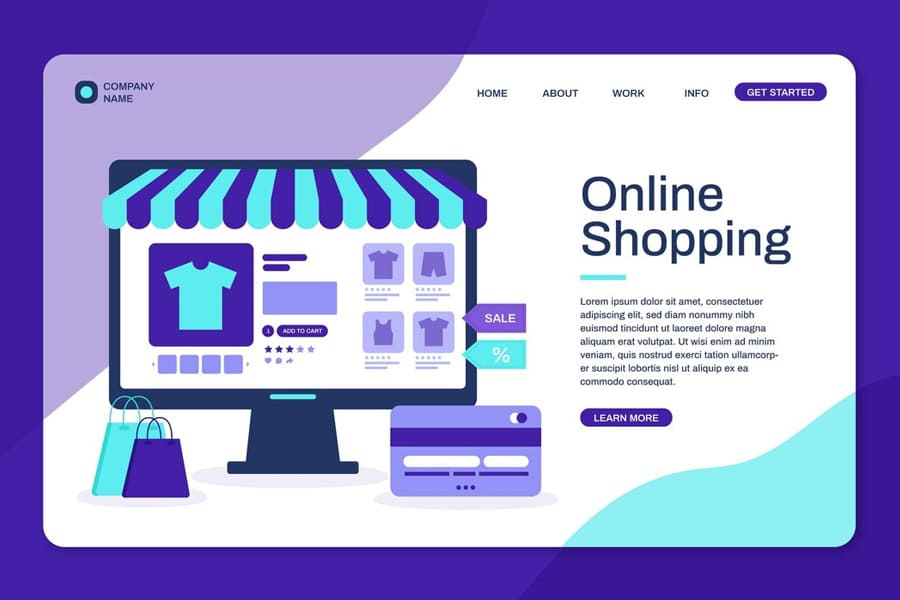
Every part of your website must be perfectly designed, from the header to the footer.
That’s why this article will tackle the often-ignored website footer. What is it, why is it important, and how will your business benefit from a well-designed footer? Let’s dive into the questions.
The Purpose and Importance of Website Footers
For many, the “website” simply means what they can see “above the fold.”
Business owners neglect the importance of their footer – after all, who scrolls to the very bottom of the page? But as people seek more and more value from their online interactions, having a quality footer design is now more critical.
Case in point: the stats from a major 2018 study by the Nielsen Norman Group. While information at the “top of the page” still receives the most attention, more people are scrolling to the bottom. The 5th most viewed content is actually the very bottom.
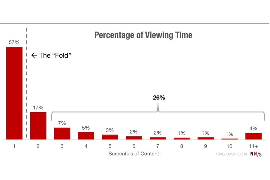
Image source: NN Group
It means that the footer is an essential part of the website, as it is one of the most visible sections for users who reach the end of the page. But why are website footers important?
Turns out, they serve crucial functions in e-commerce web design, such as the following:
- Trust and credibility: The footer is an opportunity to display legal information, such as copyright notice, privacy policy, and terms of service. It helps build trust and is particularly important in the e-commerce industry, where security and privacy concerns are prevalent.
- Navigation: The footer provides users with a navigational safety net, like essential links to the site, when they are lost or looking for specific information, improving user experience.
- Key information: By providing essential links on the footer content, such as the return policy or contact information, the footer prevents the site visitor from leaving the website and never returning.
- Brand identity: The footer is an opportunity to reinforce brand identity by including elements such as the logo, contact details, and social media icons. It can help create a cohesive and professional appearance, making it easier for users to associate your website with a reputable brand.
Essential Elements of a Website Footer
Your website’s footer is an often-underestimated space but an effective and beautiful footer design will heighten user experience and boost your e-commerce success.
In the following sections, we’ll delve into the specific components that make a footer effective, covering everything from navigation links to design principles.
Contact Information: Including Address, Phone Number, and Email
The contact information of your footer should be rich in essential details – not just the physical address of your business.
The contact page must include everything, from basic information to the most critical, such as:
- Mailing address;
- Google Maps link;
- Phone numbers;
- Email links or address;
- Customer service contact form, and more.
Placing these and other details at the bottom of your own website, even under a simple line, enhances user trust and ensures easy accessibility whenever site visitors face issues. It signals that you’re available to answer their needs at their convenience.
Navigation Menu: Additional Links for Easy Access
Navigation links in your footer features a quick route to essential pages. That is important for user experience and directly impacts key performance indicators (KPIs) like bounce rate and session duration.
When website visitors can easily find what they’re looking for – product categories, policies, or FAQs – frustration diminishes, keeping bounce rates low and session durations high.
In e-commerce, this translates to increased exploration, higher chances of conversion, and a boost in your online business’s success. Prioritizing easy access through footer links pays dividends in user satisfaction and sales.
Social Media Links: Connecting with Social Platforms
Social icons embedded in your footer are crucial for branding and community-building.
Including social links in the footer is a best practice – most websites (over 72%) include their socials in their footer design.
Seamlessly transitioning from your site to your social media accounts enhances brand visibility and audience engagement. Furthermore, when visitors can easily go to your social media and find all the positive things people say about you, it will ultimately result in a positive user experience.
This interconnectedness nurtures essential social proof around your brand.
A positive brand and a growing community attract potential customers like moths to a flame.
Copyright and Legal Information: Protecting Intellectual Property
On the internet, where content is king, protecting intellectual property is paramount
Protect your digital content with the copyright symbol claiming your content.
Copyright and legal info establish ownership and guard your website’s content against plagiarism and misuse of your intellectual property.
Plus, when you have legal statements in your footer, like your privacy policy, terms of service, and more, you also create a transparent environment for your audience – an essential signal that your audience and potential customers will be on the lookout for.
Copyright and legal information is usually laid out in a sub footer – a more simple and slim footer located below the main footer.
Privacy Policy and Terms of Service: Ensuring Compliance and Trust
Privacy policy and terms of service (ToS) links are critical documents outlining how your website collects, uses, and protects user data. It will ensure your legal compliance and build trust among your audience.
These elements are vital because they set expectations, disclose data handling practices, and establish the rules of engagement between the user and the business.
When running a digital store, having clear and accessible privacy policies and terms of service in the footer is indispensable. It demonstrates your regulatory compliance, creates transparency, and instills confidence.
Call to Action (CTA): Encouraging User Engagement and Conversions
The call-to-action (CTA) in the footer is a strategically placed prompt, encouraging users to take a specific action. You know it in different forms, such as the “Subscribe Now!“, “Click Here!” or “Try The Demo” buttons.
CTAs guide visitor’s attention, transforming passive viewers into actively engaged participants.
In online stores, where conversions are the heartbeat of success, a well-crafted CTA in the footer can encourage visitors to convert, driving sales, newsletter sign-ups, and other desired actions.
Site Map: Providing a Hierarchical Overview of Website Structure
A site map in the footer acts as a navigational blueprint, offering users a hierarchical overview of your website’s structure. It provides a quick reference for users to find a specific single page, and understand the layout of your site. Having an XML sitemap is also great for search engines.
If customers don’t find what they’re looking for in the main menu or are already pretty low on your page, they’ll go straight to the footer to go to the pages they need.
Web designers use this to enhance user satisfaction and optimize your customer’s journey.
Related Pages and Content: Facilitating Further Exploration
Showing related pages and website’s content is a gateway that will bring your audience to areas of your site that they’ll want to check out.
A well-curated selection of relevant web pages reduces bounce rates, increases average session duration, and raises customer engagement overall – giving them more chances to interact and potentially purchase your product.
A more fleshed-out footer is called a fat footer. Fat footers act as an additional navigation menu and give your customers value in their buying journey, and this builds trust. A narrow footer on the other hand only lists the most important links and website content so it doesn’t overload the page. The choice of footer size and density depends entirely on the nature of your business.
Newsletter Subscription: Capturing User Emails for Marketing
A newsletter subscription email form at the bottom allows users to voluntarily provide their email addresses to receive regular updates and promotions from your business.
A newsletter can be a powerful tool with the following benefits:
- Customer retention: Build a community and retain customers over time;
- Building a subscriber base: Grow a dedicated audience for targeted marketing;
- Increasing sales: Share exclusive promotions, driving conversion;
- Enhancing customer loyalty: Maintain engagement and foster long-term relationships with your customer base by reaching them directly in their inbox;
- Promotion and updates: Share new products, promotions, and company news.
Accessibility Statement: Demonstrating Commitment to Inclusivity
A simple accessibility statement declares a commitment to making the website inclusive for all users, regardless of abilities or disabilities. These issues are crucial for modern consumers.
For example, according to a 2021 survey by Think Know, most consumers are “more likely” or “much more likely” to support a company that publicly commits to diversity and inclusion. A survey by Kelly Services found that 71% of Americans say they’re more likely to support a business that makes employment opportunities available to individuals on the autism spectrum.
As a website owner, you shouldn’t mistake accessibility statements as a good-to-have on your website – they are crucial. Make your perfectly aligned with your brand values so it means something.
Back to Top Button: Smooth Navigation to the Top of the Page
A “Back to Top” button in the website’s footer is a small yet impactful feature that allows users to go back to the top of a web page instantly with just one click. This is essential for user experience; a quick return to the top of a product page facilitates smooth exploration.
Reduced friction in user navigation positively influences KPIs, potentially leading to increased time spent on the site and improved chances of conversion.
Design Considerations: Layout, Colors, and Font Size
Having well-thought-out footer designs can improve branding and user experience. Thoughtful choices about footer layouts, colors, and font size create a visually appealing and cohesive aesthetic.
First impressions matter so an attractive and well-designed footer can captivate visitors.
Here are some tips you can implement on that front:
- Consistent branding: Maintain a consistent color scheme, typography, and logo in the footer to reinforce brand identity and enhance visual cohesion. A mini gallery could help visualize content.
- Mindful color choices: To reduce strain, always use light font on a dark background (white on a black background) or dark font on a light background (black on a white background).
- Strategic use of space: Optimize space in the footer by balancing the inclusion of valuable information without overcrowding. Maintain a clean and uncluttered design, allowing for some white space. This will lead to better readability aesthetics.
- Mobile Responsiveness: Ensure that your footer design is responsive and user-friendly across various devices, specifically on a mobile device. Consider the limited screen space and prioritize essential information.
- Eye-Catching Call to Action (CTA): Include a visually appealing and strategically placed call to action in the footer, encouraging users to take desired actions such as subscribing, exploring products, or contacting support.
Responsive and Mobile-Friendly Design: Ensuring Accessibility on Various Devices
A mobile-friendly footer design ensures the website functions seamlessly across many devices, adapting to different screen sizes and resolutions.
Footer optimization is particularly critical for mobile users, more than desktop footers, according to Contentsquare.
In e-commerce, mobile shopping is becoming more prevalent by the day, and having a responsive footer ensures that users on smartphones and tablets can easily find what they want on your site. Additionally, poor mobile optimization can hinder search engine optimization.
Footer Design Examples and Inspiration
Now that you know some of the best practices of footer design, let’s look at expertly designed website footer examples that have done it well. Studying these footer examples will let you see how it’s done and give inspiration for when you make your own
Amazon
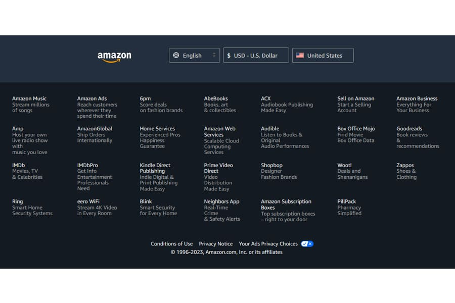
Amazon’s footer is an excellent example of an extensive and well-executed site map strategy. Despite the website’s page upon page of products, users can always go to the big footer below to go wherever they want immediately.
Amazon also displays copyright and legal information, privacy policy, and Terms of Service.
Image source: author screenshot from Amazon
Careem
The above example is a well-loved delivery service in Pakistan.
This footer example shows a simple footer design that is no less effective, showing key site links, copyright and legal information, social media, and download buttons.
Reana.pk
A popular beauty and lifestyle brand in Pakistan, Reana’s website footer example is crammed with functionality. It displays key site links, call-to-action buttons, newsletter fields, copyright, legal information, privacy policy, Terms of Service, social media icons, and more.
Bonus: NEXT BASKET
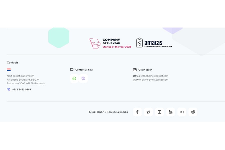
Lastly, Next Basket shows its expertise in the e-commerce world in this footer example.
Minimally designed yet packed with value, the footer shows contact information and forms for easy access, social media links, and copyright information.
Final Thoughts
Nowadays, having a well-optimized website is everything. When customers discover your brand, one of the first things they’ll do is check your website.
It’s become the “digital storefront” of your business.
For example, according to statistics curated by Forbes, users form an impression of your website in no less than 0.05 seconds. If they don’t find what they’re looking for in 5 seconds, 61% will leave, and 88% say they’ll never return after a bad experience.
With its 5.6 billion e-commerce market, having a quality website in Pakistan is everything you need if you want to stand out.
And that means having a thoughtfully designed website, from the website’s header to the footer.
Now you know everything you need to create a high-quality, valuable website footer that guarantees user experience. Now, all you need is to execute.
Frequently Asked Questions
Why is website footer design important for my online store?
The footer is a navigational hub that ensures user experience and trust. It houses essential links, contact details, legal information, and more. Having a well-designed and relevant footer contributes to overall site functionality.
Why is mobile responsiveness crucial for the footer?
Mobile is where a lot of e-commerce happens, so mobile footer responsiveness ensures a seamless experience on all devices, reducing bounce rates and improving accessibility.
What is an infinite page footer design?
Having an infinite page means not having a footer, just the next batch of content. This type is often utilized by news and media sites. Media sites want you to keep scrolling for more content, so putting a footer will be against their goals.