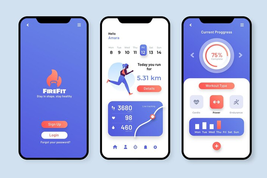
Think of the times you used a mobile banking app with a good UI design. Once you log in to the app, you can immediately see your bank balance, alerting you if the value is wrong. You can also quickly transfer money to a friend if the user interface design is intuitive.
You may not have paid much attention to the buttons, but they act like signposts in the overall user interface (UI) design. These buttons with strong call-to-actions determine the user experience. The mobile banking app shows a confirmation message to ensure you don’t transfer wrongly, and the simple layering shows the app’s user interface is excellent.
One of the perks of UI design is that it makes our lives easy. Like the famous saying, a good UI is unnoticeable. In this article, we dive into the nitty gritty of UI design, and through that, you will learn more about what UI design is.

Definition and History of UI Design
User interface design is the process where a UI designer determines the look and feel of the interface built for applications, software, or computerized devices. UI designers aim to create interfaces that can be easily navigated and pleasured in UI design.
Indeed, the UI design contributes to UX design – the entire customer experience from their first to last touch point. So, paying attention to your site’s UI is essential to give your users the best experience.
The journey of user interface (UI design) and user experience (UX) design all started in the 1970s after the introduction of the graphical user interface by Xerox PARC. However, GUI was later brought to the limelight by Apple with the Macintosh in 1984. This has forever changed how people interact with computers.
Later on, the introduction of the World Wide Web in the 1990s impacted the growth of UX/UI as it’s impossible to do without them. The increasing use of mobile devices also made it mandatory for a UI and UX designer to create mobile responsive designs.
Key Principles of UI Design
Below, we will review some of the key UI design principles, so you can get familiar with them.
Let’s see them in detail:
- Consistency: We have all heard the common phrase: “Consistency is key.” It is no different from what User interface (UI) design is about. The complete quote by Mike Gilfillan says, “Consistency is key; multiple colors, fonts, and styles can create confusion, while consistency creates familiarity.” A site will be more accessible for the user if certain elements remain consistent.
- Familiarity and predictability: There are specific designs that users expect to see in some user interfaces. For example, using the home icon in order to represent the search bar makes no sense to the user. How a user interacts with an app depends on past interactions with applications, so it’s important to be predictable.
- Feedback: Do you ever feel like you are talking to yourself in a meeting because you have not gotten any response from your listeners? That is precisely how it will be to the user when they are not receiving feedback from an app or site.
- Efficiency: Depending on the product knowledge of the user, provide new users with guidance. While you should give experienced users an edge with shortcuts and accelerators.
Last but not least, the accessibility. UI designers are responsible for creating user interfaces accessible to every end user. WHO reported that about 285 million people are visually impaired, about 150 million adults have mobility difficulties, and 360 million have hearing loss. So, it’s important to consider them when building user interfaces
User-Centered Design
User-centered design (UCD) is a recursive design process where designers focus on the user’s needs at each design process phase. Throughout this process, designers involve users using various research techniques.
These techniques may include investigative methods and tools to understand users’ needs and improve user experience. It is believed that Steve Jobs encouraged user-centered design in his lifetime.
Importance of UI Design in Web and Mobile Development
User Interface (UI) design plays a significant role in web and mobile applications, especially in the ecommerce app development industry.
Let’s see why:
- User Engagement: Excellent UI design encourages user engagement and participation. Visitors staying on your website for longer due to its intuitive, visually appealing, and simplicity will likely affect your ranking.
- Intuitive Navigation: A well-designed user interface makes it easy for users to navigate between pages and find information quickly.
- Branding and Visual Identity: UI design reflects your brand identity. To build trust and recognition, incorporate consistent color schemes, logos, and visual elements that align with the brand.
- Accessibility: A good UI design ensures that websites are accessible to users with disabilities. Features like adjustable font sizes, high contrast options, and screen reader compatibility make the web more inclusive.
- Loading Speed and Performance: UI design can also impact the loading speed of your site. Optimized graphics and a well-structured layout contribute to faster loading times, reducing bounce rates.
Consistency in UI elements and design patterns across platforms prevents users from getting frustrated. With a familiar interface, you encourage users who wish to transition devices to keep using your product. Lastly, a good UI design can positively impact conversion rates. Clear call-to-action buttons and a swift checkout process contribute to higher conversion rates.
Role of UI Design in User Experience (UX)
The term UI/UX design is quite popular, but UI design contributes to the bigger picture, which is user experience (UX) design. For example, a website’s UI is the user’s first touch point, which means the UI design decides the first impression.
We know that first impressions can make or mar your customer’s impression of you. For example, you will likely not patronize a business with poor customer service; the same applies to a website. The UI is the starting point; user navigation through the site will be the most visible element.
Users can easily understand and navigate the product with a precise and well-crafted UI design, such as clear menus, intuitive controls, and straightforward layouts. Additionally, users appreciate a sense of familiarity, so consistency in UI elements guarantees them a predictable experience.
Elements of UI Design
We will focus on three significant aspects of UI design: the typography, the colors and the layout structure.
Let’s review each one in detail, so you can understand what are the most important elements of the proper UI design.
Typography
Most people argue that typography doesn’t affect design much, but it does. It is one of the essential elements that decide the appearance of the UI design. Typography is the style and appearance of a text. In the UI design space, typography is text arrangement to make it legible and appealing.
It involves choosing the suitable typeface, font, size, and white space for a desired reaction from the reader. Typography has been used for communication for years, but with the advent of technology, it plays a significant role in UX/UI design.
Color
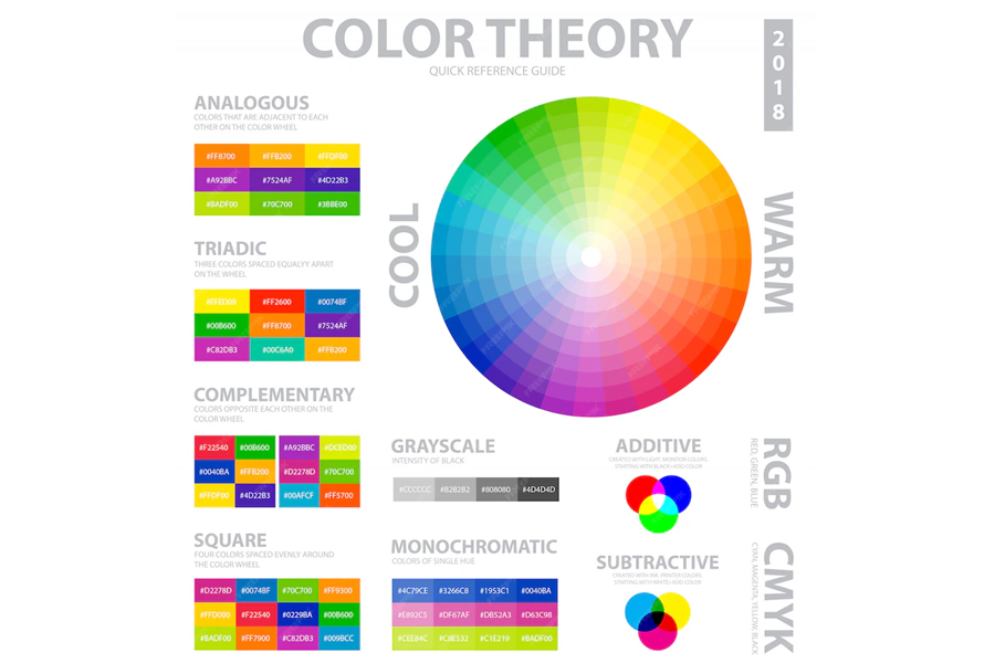
The role of color in UI design, brand identity, and user perception cannot be overemphasized. Choosing suitable colors is essential as it influences how users perceive and interact with a product.
The secret to choosing colors that best reflect your brand design is to select a well-balanced color palette. Determining your primary and secondary colors will help you achieve your business objectives.

Layout
Layout refers to how elements, typography, graphics, colors, and icons are arranged on a website to decide the feel and look. It determines the personality of your website and controls users’ perceptions.
There are several layout types, but one of the most popular types is the visual hierarchy design. It’s a design layout style that manipulates design elements to direct users’ attention to the most critical parts. Other types of UI design layouts include the grid layout, the table layout, and the flow layout.
Differences Between UI Design and UX Design
The image below summarizes the difference between user experience design (UX design) and user interface design (UI design). However, we will shed some light on the matter below.
| Differences | UX | UI |
| Application | Applies to physical and digital products | Applies to only digital products |
| Focus | The full experience from end user’s first touchpoint to last | Visual touchpoints |
| Solution | Creates solutions to users’ piano points at any point of using the product. | Combines typography, color palettes, buttons, animations, and imagery. |
The UX is not limited to digital products but includes non-digital ones. For example, if you find pouring ketchup from the bottle hard, it has a poor UX experience. UX has mainly been associated with the digital field because that’s how it became popular.
While user experience is focused on giving users an enjoyable experience (online and offline), user interface design is the look and feel of only digital products and contributes to UX. Consider UX design as the faculty and UI design as the department.
Common UI Design Patterns and Best Practices
Do you want to learn some important design principles and best practices in applying them in your UI design? Read on, as we are about to discuss this in the next lines.
Let’s review this in detail:
- Navigation: Navigational patterns help users get around the website and find their way to the homepage when lost.
- Social sharing: Nowadays, blogs include a share icon for their content, so once you highlight a text, a pop-up with a share icon appears. Users can share it on Instagram, Twitter, LinkedIn, or any other social media platform.
- Lazy Forms: From submitting their details to subscribe to your newsletters to using the chat box to speak to customer service agents, lazy forms make life easier.
- Lazy Registration: Due to having too many forms to sign up to, users will likely get tired and be hesitant to fill out lengthy forms. So, some apps and sites only ask for username and password confirmation. Some even go as far as allowing users to use simple tools without signing up.
Autofill is another feature that makes the user’s life easier and makes them more willing to sign up.
Tools and Software Used in UI Design
Nowadays, you can’t create a good UI design without the help of specialized tools to help you with the process. In this section we will check the three most used UI design tools used in the UI design.
Let’s see them below:
- Sketch: If you have been in the UI design environment for some time, you may have heard of Sketch due to its popularity and features. Its smooth alignment and resizing feature make it easy to deliver design projects faster. It also allows for easy integration of third-party plugins. The major con of Sketch is that it is only available on macOS.
- InVision Studio: InVision has been a go-to interface application for UI design and functional prototypes with dynamic elements and animations. Its tools are intuitive, enabling collaboration across teams—for example, cooperation between designer and developer.
Another UI design software is Figma. It is the most popular online UI design tool, allowing designers to build dynamic prototypes and mockups and test them for usability. It also enables team members to collaborate on a project simultaneously, like Google Docs. This means you will see real-time changes and who was responsible for the change.
Challenges in UI Design
UI design is about creating the most suitable product for users and improving their experience with your product.
Some of the challenges faced by UI & UX designers are:
- Lack of time or tight deadlines;
- Not enough knowledge of the target audience;
- Low product reach, which affects feedback quality and quantity of the product;
- Complex product that needs extra learning to understand;
- Too many features, etc.
Therefore, UI designers should tackle these problems alongside new challenges like accessibility, localization, and globalization.
UI Design Trends in Web and Mobile Development
It is always recommended to stay on top of the wave with the latest design trends and patterns in web and mobile development.
Below, we will review some of the latest trends in user interface design.
Dark Mode
Dark mode, also called night mode, is a light-on-dark color scheme. Some people prefer dark mode to light mode, especially with an app like Twitter.
It became fast rising following the release of Android 10 & iOS 13 and has become one of the most popular trends since 2023. People who enjoy their phones with the lowest brightness want dark mode because it emits less light, which reduces eye strain, making it easier to fall asleep.

Neomorphism
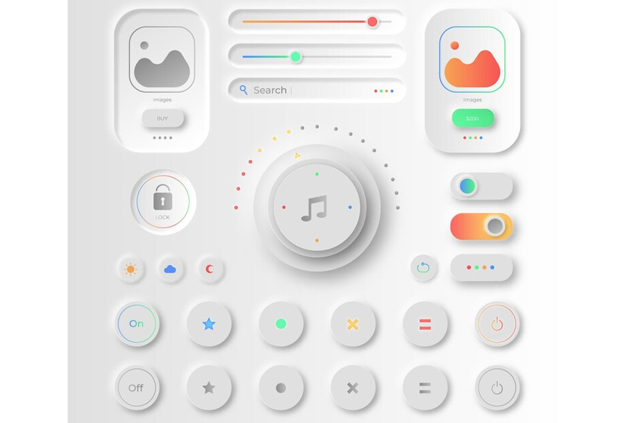
Neumorphism has also gained popularity lately for its subtle yet innovative look.
It is an in-between version of skeuomorphism and flat design that focuses on the color palette rather than contrast.
Advanced Micro-Interactions
Have you ever heard the saying: The little things count? Yes, they do matter, especially in UI design. Micro interaction allows designers to give users a dynamic and engaging experience where they see some animation effect after clicking a button.
The user interface reacts to users when they interact with it, allowing for engagement and significantly impacting user experience.
Voice-Activated User Interfaces
Users have a million things to do daily, so with a voice-activated user interface design, things become more accessible. Thanks to voice assistants like Alexa, Siri, and Bixby, UI designers have started allowing users to interact with their voices instead of typing whenever they need a response.
Speechly is an example of a company leveraging voice-activated user interfaces and taking it one step further.
Immersive 3D Elements
UI design with 3D elements is not new, but they have become more popular, diverse, inclusive, and immersive. It’s becoming the new norm in UI design. UI designers have found ways to combine 3D elements with animations through technologies like Augmented Reality (AR) technology and Virtual Reality (VR).
3D elements are more interactive and profound; they make things look natural and imprint in users’ minds. Also, they convey the energy and feeling that brands want to portray smoothly. However, it requires extensive skills to design a smooth 3D experience.
How to Create a UI Design Strategy
A UI design strategy is vital for designing aesthetically pleasing designs with which users would love to interact.
Explore the following steps to creating a successful UI design strategy:
- Define objectives: You have been running your company and want to launch a website or app. Yay! Congratulations. But first, you need to outline your goals and objectives. What are you trying to achieve with your UI design? This will help guide your user research so you are just looking at the wrong place.
- User Research: User research is the sole foundation of UI/UX design. Without in-depth and precise research, you may design a site that scares users off. You should take note of ideas you already have, but research before drawing out any sketches.
- Wireframing: Wireframing involves creating low-fidelity outlines of the interface’s layout and structure. Like construction drawings for buildings, wireframes will serve as a template for the actual design. It helps decide information hierarchy, placement of elements, and overall flow.
- Visual design: Visual design is tied to transforming all your work into a visual design. You must decide on a suitable color scheme, fonts, and typeface and design a library of all necessary visual elements. This stage may also involve tweaking the wireframes because you will recognize new rooms for improvement as you start designing.
- Prototyping: This stage involves converting the static pages into interactive prototypes. It allows you to see your designs in action.
- Testing and iteration: At this stage, you test whether the user loves what you have built by allowing an actual end user to navigate through a prototype. This stage helps you discover whether pain points have been addressed and if usability issues were missed.
The entire step shows us that UI design strategy is a journey and a learning phase. It doesn’t end at user research; it is continuous. The next stage of UI design involves developing the designed product. Designers should explain how they want the designs to behave so that the design works flawlessly.
The Future of UI Design
As long as ad technology remains in use, you can expect UI design to continue changing. We have mentioned current trends in this piece, like a dark theme, lazy signup, neomorphism, and more that were not around ten years back. This tells us that in 5 years, they will have advanced, and some new design patterns will have arisen. However, the main idea of UI designs will forever hold: Great designs don’t allow users to think, and they are unnoticeable.
So, when integrating VR into your designs, you should never forget that it’s not about the creativity but the impact on users. However, future trends indicate that users also want more; they want a bit of creativity, but the functionality should also improve significantly.
Frequently asked questions
Why is typography important in UX design?
Typography is essential because it defines the appearance and style of text users will see when they get to the site. It usually determines the way people feel after reading texts on your site. Imagine how a developer feels after visiting a development tool with thin, stylish, and curly fonts. They wonder if it’s a fashion store and may not enjoy their experience.
How many types of UI design are there?
There are five main types of UI design, which include Graphical UI (GUI), Touchscreen UI (TUI), Command-line user interface (CLI), Voice-controlled UI (VUI), and Gesture-based UI (GUI).
What is the most popular UI design tool?
The most popular design tools are Figma and Sketch—other popular design tools are Invision, Proto.io., and Craft.