Your ecommerce logo is part of your branding. It should be professional and distinguish your brand from other online businesses.
Getting a logo design for your online store involves typography. When you want to create an ecommerce logo with a unique design for your online shop, typography’s role cannot be underestimated. This is because typography in your shop logo shows your brand personality, helps you connect with your customers, and retains top-of-mind awareness for your brand.
If you’re looking to learn how to design your brand logo and separate your business from the competition, read on to find out how typography helps ecommerce logos achieve recognition among target customers.
This article will, therefore, discuss the major role typography plays in logo designs.

The Basics of Typography: Understanding Typeface, Font, and Style
What is Typography?
Typography is the technique of organizing or arranging written letters and text into a clear, visually appealing, and legible format or content for readers or users.
With typography, you can intentionally use various elements such as spacing, layout, and alignment to communicate with your audience and evoke powerful emotions.
It is also used to enhance the visual appeal of a written text for readers or users. Font style, appearance and structure are all useful elements in typography that can convey a deeper meaning to unique messages.
Typeface, Font and Style
In typography, we have three important concepts:
- Typeface
- Font
- Style
Typefaces
A typeface is an umbrella group for a specific design style with diverse sizes and weights.
A typeface covers all the design characteristics, such as the characters’ shape, width, and volume. Examples of typefaces include Garamond, Times New Roman, and Helvetica. It’s important to know that each type has a unique personality or tone it conveys.
Fonts
A font refers to the specific size, volume, shape or style typically found in a typical umbrella typeface. It is a digital handwriting that helps to create consistency when conveying written works.
Each font is unique and expresses different meanings. For example, Arial Regular, Arial Bold, and Arial Italic are different fonts within the Arial typeface family.
Styles
Style refers to the shape, weight, or slant of the characters. Style in typography usually influences the legibility and visual appeal of the text, as well as the emotions conveyed.
There are varying styles within different typefaces. Each style affects how readers interpret the written content.

How Typography Affects Your Brand Identity: Psychology and Perception
Typography in ecommerce logos affects your brand identity in more ways than you can imagine.
Your company is not just a business but also a brand. To stand out uniquely, you must develop a strong identity that is not easily replicable. This identity encompasses your visual and non-visual modes of communication with the market, such as your logo, colors, and typography.
This is why your logo typeface and font can influence how your target audience perceives your brand.
Your brand identity could be humorous, rebellious, minimalist or even audacious and all that within the logo design.
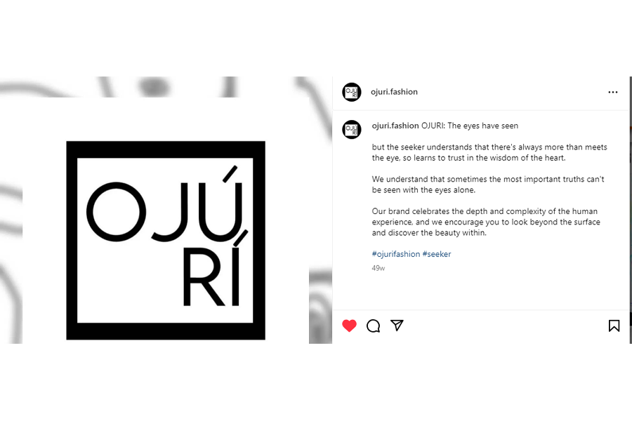
For instance, serif fonts could be interpreted as traditional and elegant, while sans-serif fonts could be perceived as fashionable, clean, and minimalistic. And when you opt for script fonts, your target audience can perceive your brand as sophisticated, creative or romantic. Display fonts, on the other hand, can be regarded as fun and attention-seeking.
Therefore, you should be conscious of selecting the typeface and font you use for your ecommerce logo design because your target audience can connect with it or dissociate from it.
Serif vs. Sans Serif Fonts: Pros and Cons for Ecommerce Logos
Serif fonts and sans serif fonts have recently become among the most common font styles in typography. Although both fonts are quite similar, they are also remarkably distinct from each other.
Below, we discuss each font style and their pros and cons when it comes to ecommerce logos.
What is a serif?
Serif fonts in typography are defined by having artistic strokes added deftly to the ends of each main stroke in a letter or symbol.
Serifs are regarded as one of the oldest font types, and their origins are believed to be from the first official Greek writings and Latin alphabet inscriptions.
Pros and Cons of Serif Fonts for eCommerce Logos
Serif fonts can be used to design unique logos for your online store. However, there are pros and cons of using them.
Pro: Regarded as traditional, elegant, and timeless
Serif fonts are more traditional and regarded as timeless. This means that when you choose serif fonts for your ecommerce logo, you convey a sense of elegance and sophistication to your customers and target audience.
Pro: Enjoy the trust of your customers
You can also use serif fonts for the text of your ecommerce website design to exude an air of professionalism and reliability for your brand.
The image with the font alone also suggests an impression of legacy. This is because serif fonts are historical and known to originate from as far back as the 15th century, which makes customers intuitively feel safe with them while shopping.
Examples of brands that use serif fonts in their logo designs include Vogue, Honda, Sony, Coach, Rolex, Tiffany & Co., and Time.
Con: Less modern
Serif fonts are estimated to be less modern, which can discourage younger audiences from associating with them. If your brand targets a more contemporary audience, you might find it difficult to connect with them when you use a serif font in your logo.
Con: Legibility at small sizes
Some serif fonts are less legible and clear at smaller sizes, especially in digital formats. This can make it difficult for the logos to be displayed on mobile devices or in situations where the logo needs to be scaled down.
Overall, serif fonts are great for conveying a sense of authority and legacy. They are a great choice for your brand if you’re looking to appear trustworthy and reliable to your target audience.
What are Sans Serif Fonts?
In contrast with serif, sans-serif fonts don’t have such strokes. With no strokes and tails, sans-serif fonts look clean and simple.
Pros and Cons of Sans Serif Fonts for eCommerce Logos
Sans serif fonts for ecommerce logos are a wonderful choice if you aim for a simple and modern look and feel for your brand. Brands such as Google, Facebook, and Netflix use sans serifs in their logos. Below are the pros and cons of sans-serif fonts for ecommerce logos.
Pro: Modern and clean
Sans-serif fonts have a clean and modern appearance. They often convey a sense of simplicity, minimalism, and contemporary design, making them suitable for brands looking to project a modern image.
Pro: Versatility
Sans-serif fonts are versatile and adapt well to different design elements and layouts. They work effectively in various sizes. They are suitable for logos with both text-heavy and minimalist designs.
Con: Less Formality
Sans-serif fonts may be perceived as less formal than serif fonts. While this is an advantage for casual and approachable brands, it may not align with the desired image of brands aiming for a more traditional or formal tone.
Sans serif fonts are, overall, clean and simple. If you want to appear straight-to-the-point and youthful, sans serif fonts are your best bet.

Script and Display Fonts: When to Use and When to Avoid
What are Script and Display Fonts?
Script fonts imitate the style of handwriting or calligraphy. They usually have curvy, thin and fine elements and convey a sense of formality, elegance, and femininity. Script fonts also express artistry, elan, and warmth.
If your brand has an artistic or romantic identity, then opting for script fonts can help you communicate that sentiment effectively through your logo. Script fonts are perfect for visionary, unique or niche brands. Examples of brands with famous logos that use script fonts include Coca-Cola, Disney, and Cadillac.
Display fonts are designed to be conspicuous and peculiar. They typically have striking shapes, styles, and features.
You won’t be able to effectively use display fonts at small sizes. They convey a sense of fun, liveliness, and nonconformity. If you want your business logo to communicate an audacious, adventurous, or unconventional feel, then go for display fonts. Lego, MTV, and Nintendo are famous brands that use display fonts.
Both script and display fonts are used primarily for short blocks of text or things like headlines and titles. Knowing when to use and when to avoid both script and display fonts is crucial.
When to Use Script Fonts?
To convey elegance and sophistication
Script fonts are often associated with elegance and sophistication. If your ecommerce brand has a luxurious or high-end identity, you may want to use script fonts to convey a sense of exclusivity and refinement.
To establish a personalized connection
Since script fonts mimic cursive handwriting, you can use them to add a personal and human touch to your brand. This can help you connect more intimately with your customers.
To represent feminine and artistic brands
If your online store sells fashion, beauty, or handmade products, then script fonts are suitable for your brand.
When to Avoid Them?
Smaller sizes or digital formats
Some script fonts may not be readable at smaller sizes or in digital formats. Therefore, avoid them, especially if your brand relies heavily on online platforms.
Inconsistent brand identity
If your brand desires to convey a more modern, straightforward, or masculine image, a script font may be inconsistent with your desired brand identity. Therefore, it’s best to avoid them.
Script fonts help communicate your audacious brand personality to your target audience. However, it’s best to avoid them if they are illegible or inconsistent with your brand identity.
When to Use Display Fonts?
Attention-grabbing headlines
Display fonts are designed to be attention-grabbing and impactful. This is why they work well for headlines, banners, or any prominent text elements where the goal is to capture the audience’s attention quickly.
Creative and artistic expression
Display fonts offer a wide range of creative styles. Therefore, if your ecommerce brand is in the creative industry, such as art, design, or entertainment, you can use display fonts to express a unique and artistic identity.
When to Avoid?
Body text and small sizes
Display fonts are generally not designed for extended reading or small sizes. Avoid using them for body text or any text that requires sustained reading.
Generic look
Avoid display fonts that can make your logo look outdated or generic.
Display fonts are perfect for your ecommerce brand if you aim to communicate your audacious and zestful brand personality. However, it’s best to avoid overusing them to maintain overall clarity for your audience.
Custom Typography for Your Ecommerce Logo: Pros and Cons
You may want to go for a custom typography for your ecommerce logo instead of pre-existing, free logo fonts that you can get from an eCommerce logo maker. You must understand the pros and cons of choosing a tailored, custom font for your eCommerce professional logo design.
Pros of Custom Typography for Your Ecommerce Logo
Choosing a custom typeface and font for your ecommerce logo has several benefits.
One of the primary ones is that it gives you a unique brand identity. Your brand identity appears distinct enough to be instantly recognized among the fierce competition. This can also make your customers perceive your brand as exclusive.
Custom typography also allows you to communicate your brand messaging and personality how you want to. You get to completely control the narrative with each curve or stroke. You can’t do this with pre-designed fonts. This control also extends to using icons of your choice to add more depth to your logo.
With custom typography, your brand becomes more memorable. In a highly competitive market, you want to be memorable to consumers.
A custom typeface can help you achieve this. You can further use an icon that instantly drives brand recall among your target customers.
Cons of Custom Typography for Your Ecommerce Logo
While custom typography is a fantastic choice to go for when you want to design your ecommerce logo, there are some cons you may want to consider as well.
First, creating a custom typeface and font for your ecommerce logo can be time-consuming and cost-intensive. You will need to hire and collaborate with professional font designers and typographers, and this can be challenging if you have budget constraints.
Additionally, you can struggle with maintaining and updating custom fonts, eroding consistency across multiple branding materials and other communication channels, such as your website and social media pages. You may also need to change or evolve your logo later, which can also be challenging.
Furthermore, custom typefaces can be too complex and unconventional for your target audience to read and understand.
Lastly, custom fonts may not always be supported across all devices and software. This can lead to compatibility issues, affecting how the logo appears to your target customers, especially in digital environments.
How to Test Your Ecommerce Logo Typography: User Feedback and A/B Testing
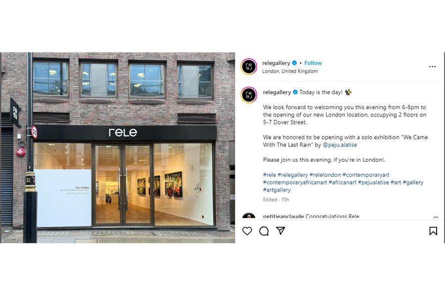
It’s not enough to create an ecommerce logo, you also have to test your logo typography to ensure that it connects well with your target audience and increases your brand recall. Two tried and tested ways to do this are gathering feedback and A/B testing.

Gathering Feedback for Your Ecommerce Logo Typography
You can use different techniques when you want to gather user feedback for your ecommerce logo typography.
Use surveys
Surveys are a great way to learn the audience’s feedback about your choice of font or typeface.
Ensure that you include questions about how your target audience perceives your font. Do they think it’s audacious, memorable, distinct, or artistic? Do they think your font choice represents your brand accurately?
Use social media polls
Social media polls can also provide valuable insights into how your audience perceives your ecommerce logo typography. You can upload different logo designs and ask your audience to vote for the one that resonates best with them and accurately represents your brand identity.
One-on-one interviews
One-on-one interviews are another technique you can use to uncover the perceptions of your target audience about your logo typography. Ensure that the feedback you receive from one-on-one interviews is constructive and helpful in settling for the perfect typography that best depicts your brand.
The above techniques can help you to gather accurate feedback that can aid you in refining your ecommerce logo until you arrive at the perfect choice.
A/B Testing for Your Ecommerce Logo Typography
A/B testing is another verified technique that can help you choose your brand’s best ecommerce logo typeface and font. Below are some of the most reliable steps you can take to conduct seamless and effective A/B testing for your ecommerce logo typography design.
Identify your goals
You need to identify and define your goals for the A/B testing. Do you intend to find out which typography connects best with your customers? Or do you want to know the most legible and readable font for your audience? A clear outline of your goals will guide you in conducting the A/B test.
Choose your variables
Since you want to test the typography of your ecommerce logo, your variables could include font style, font size, letter spacing, and color. Ensure that you choose one variable at a time to test. This will make it easier for you to tell which change is the most impactful.
Design your test variations
It’s now time to create both versions of your logo with your preferred typography variations. The differences between the two versions must be clear and significantly distinct.
Set up your test
It’s now time to implement the A/B test on your ecommerce platform or website. You can implement this test with A/B testing software or tools provided by your ecommerce platform.
Ensure that you randomly display each logo variation to your visitors or customers so that each version receives an equal number of impressions.
Analyze your results
At this point, what is left to do is to assess the performance of the two logo variations based on the data you’ve obtained. This will help you ascertain the typography variation that better meets your set goals.
Use your winning variation
After ascertaining the winning typography variation, the next thing you can do is implement it as the new logo design for your ecommerce brand. Ensure you continually observe its performance and optimize accordingly as you gain new feedback.
A/B testing can help you settle for the best typography design for your ecommerce logo. This will help you to connect better with your target audience.
Best Practices for Typography in Responsive Design: Mobile-Friendly Ecommerce Logos
The typography you settle for must also be responsive and mobile-friendly, as 79% of customers use their mobile devices to shop online.
These visitors who land on your website must be able to easily recognize, understand and recall your ecommerce logo. Below are some best practices to follow when choosing, creating or designing mobile-friendly and responsive typography for your ecommerce logo.
Ensure readability
Your typeface should be readable at smaller sizes and on smaller screens like mobile devices. Avoid complex or denser typefaces that are difficult to read on mobile devices.
Choose the appropriate font size and responsive fonts
The font size hierarchy you should use for your website must be adaptable and scalable enough for different screen sizes.
Use a scalable logo vector
A scalable logo vector will help to maintain the quality of your logo design format when resized for responsiveness on mobile devices.
Avoid using raster graphics such as JPEG or PNG files, which are made up of pixels and can lose quality when resized. Logo vector graphics come in scalable vector graphics (SVGs) and Encapsulated PostScript (EPS), perfect file formats for logos.
The above best practices can aid you in choosing mobile-friendly and responsive typefaces and fonts for your ecommerce logo, enhancing your brand identity and recognition.

Avoiding Common Typography Mistakes in Ecommerce Logos
There are common typography mistakes that you can unknowingly make when creating or designing your ecommerce logo. Below, we will help you identify these mistakes to enable you to avoid them as you select the perfect eCommerce logo for your brand.
Using unsuitable fonts
This is a common typography mistake even professional designers make. The font you select should align with your brand tone and mood. But when the opposite is true, you risk disconnecting with your customers and losing their trust.
This is why you should avoid making this mistake. If you are unsure about the fonts suitable for your industry, it’s best to do your research and learn from your competitors.
Including too many fonts in a single logo
Using too many fonts in your ecommerce logo is another mistake you should avoid making.
You don’t want your logo to appear chaotic, disorganized and inconsistent. Try to use a single font or at most two fonts in your logo and use variations of the same font regarding weights, sizes, or styles for clear hierarchy and contrast.
Disregarding spacing
When you disregard adequate spacing in your logo, you destroy its balance, visual appeal, and readability. You also risk projecting an amateur brand image to consumers.
Avoid this mistake at all costs. Adequate spacing helps the letters in your logo become readable and legible.
Overlooking scalability
Your logo should be adaptable to different sizes and formats, including social media pages, billboards, and your website.
When you overlook this and choose a too complex or colorful logo, you can have a lesser quality when you scale it up or down. You should avoid this mistake, even if you are excited about using a logo that stands out. Your logo can stand out and still be scalable for different mediums.
Skipping feedback and testing stage
Finally, a common mistake many entrepreneurs and designers make is skipping the feedback and testing stage.
No matter how enthusiastic you are about your logo, it’s better to test it for feedback than to release it without testing.
This is because the general public will interact with it, and you can’t control their reception when it’s already made official. They may be unable to connect with it, negatively affecting your brand image and reputation.
Avoid making this mistake. Always subject your logo design to testing and feedback so that you can choose the most impactful typography that resonates well with your customers.
The abovementioned mistakes are quite common, but you don’t have to make them now that you know them better. You can avoid them and enjoy the benefits of selecting the right fonts and typefaces for your ecommerce brand.
Frequently asked questions
What is an eCommerce logo?
An ecommerce logo is a visual symbol representing an online business buying or selling products and services. It typically reflects the brand identity, values, and nature of the ecommerce platform, aiming to create a memorable and recognizable image for customers.
What is eCommerce branding?
Ecommerce branding involves creating a distinct and cohesive identity for an online business. It encompasses elements such as the logo, cart design, color scheme, typography, messaging, and overall design aimed at shaping the brand’s perception.
What makes a logo look high-end?
The right colors and fonts contribute to making a logo appear luxurious. Most importantly, less is more when it comes to designing high end logos. Try to be as minimal as possible in your design.